|
FAILURE
|
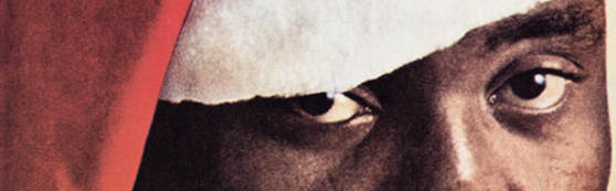
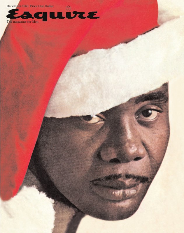
Innovative design sometime is about taking risks. As was the front cover of “Esquire” with the African American boxer Sonny Liston, who pose as gloomy Santa Claus, where the image could easily incite hot debates, civil rights, and the changing cultural landscape of America. Designed by the great George Luice in 1962, the cover brings to the magazine about 750 000 dollars lost, from decline in sales and many canceled subscriptions.
|
|
GET IN TOUCH
|
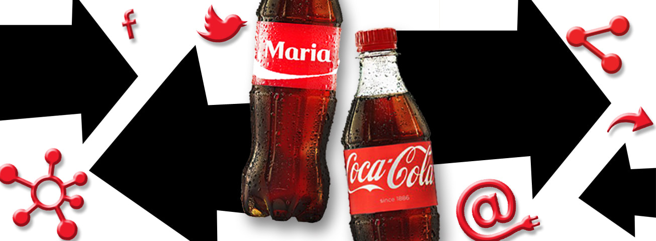
In the past designers were thinking mostly about how to get in touch with the customer, more and more closer. Today this is a fact. Can you imagine that Coca-Cola one of the biggest world brands will remove its logo from one side of the bottle and will put your name there. Coca-Cola get more closer to the user than ever. The connection between brand and user is on its peak. Today reaching the customer is not enough, presenting your product is not enough. It is main priority to have communication in both ways: brand to customer and customer to brand. It is about to communicate, to share, to speack, to follow everywhere and in social networks, where there is dialog between both sides. This needs of today advertising is so strong that even a new professions come up - Social Network Relations,somebody who is taking care of the brand image on the social network, by publishing interesting and actual post daily.
|
|
WORDS & COLORS
|
Looking at language improvement in time, we can judge human progress. We believe that the thought is forming the language, not opposite. BUT NOT IN RUSSIA.
In English language there is only one word for - blue color. We can describe different blue colors, dark blue, light blue, sky blue, baby blue. In Russian language is different, there is two seprate words for blue color "голубой" lighter blue and "синии" for darker blue. And here's the interesting part. When showing color catalogs to russians and americans. Russians not only can describe the more tones of colors, they can also see* more colors, to recognise more tones of one coloer ,more than other people. In 30`s on 20th century the linguists Sapir and Worf had theory " linguistic relativity" , where it says, the language not only describe the world around us but also determines how we perceive the world. The language not only expres our thinking, but also form it. 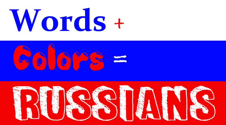
|
|
NON ENDING
|
Sometimes the design can change shapes and go into something unusual, like keep going without ending, continuing in next edition, chapter or video, telling us a long story slowly in time. The best funny example for this is the Italian TV commercial. Where a prisoner who is going to die is asking for last phone call. His phone call is so so long that the soldiers get bored while waiting him to finish. The idea of his non ending call is continuing in the time. There is serial of commercial videos how his phone call is keep going. The commercial ad is very successful, that the story of his last phone call i s coming over 12 separate videos.
|
|
CURIOSITY
|
Speaking about good ideas, I have to mention Spanish TV advert for culture exhibition " Millennial China ". The video use a chinese model who speak, nothing unusual. But the video clip was playing on spanish television and the model was speaking in chinese language. For about 30 seconds, on the screen was only the model who was speaking and probably 99,9% not understood from the audience. And here at the moment of surprise, unusual , non understanding, wondering; a voice come up behind saying " Understand China , which you never had understood. Visit the exhibition of Millennial China". The TV advert is successful and memorable, once you waking up the curiosity, the memory ability rise double.

|
|
CONCEPTUAL
|
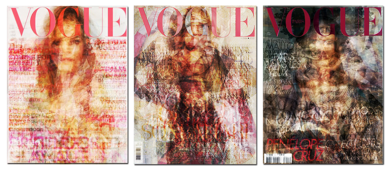
Conceptual design is this type of design where you need introduction, for appreciating it. The photos underneath are front covers of а magazine. The project is called Voque of Voque and is combining every published cover in 2010. The idea of putting all 12 covers together on the final edition of Vogue is like visual resume of the year. The design of one united cover vision was realized in many Vogue branches as China, Turkey, Italy, France, Germany, Australia and others. This is perfect example of conceptual designing where the idea makes the design.
|
|
EDUCATION
|
Is it not the Sight sense one of the most important for our life. More we see, more we understand life around we us. We are naturally engaged with visual information. This means that the visual education is one of the most important things and the education in visual grammar must be our goals. But what is the situation in our educational system? For example from the first year at school to the university level we learn about alphabet, structure of sentence, meaning and function of words, how to combine words and make sentence, how to write beautiful, how to create our thinking, how to write a letter, essay and even books. Writing skills are in the base of our education. But wait for a second where is the visual education, practically we stop study visual since after 7- 8th year of our education. No more paint and brushes in our school bag. May be because we think visual science work by instinct, simple оr easy and we just think of it as given to us. NO is not like this, we have to work on it. Visual literacy also need improving process. One thing is to speak in some language another things is to write and read on same language,or know its past and best writers. The Visual also has its history, structure, parts, secrets, compositions, meanings, heritage and so on. We all know that one picture can give much more information than 100 words. You just need to be educated to see it. You can learn so much from what you see, you just need to have good base of education to see it. Visual language present in human history since Lascaux cave's drawings till today with turn off-on buttons.
Let have a look at design education, is very specific around the world. For example Asian education system is different than European. In their school programme the Art classes present untill the end of their education at uuniversity, explainted with the fact that the art can give a lot to the students and build their personality. Specialy about design they did such a big progress. In 1970, in Japan, South Korea, and Singapore there were no design schools. But in the early 2000s there are more than 23 design schools. Another case is Robin Puiter who founded design and advertising school in South Africa, educating many young black people. In period when employing black people wasn't allowed. Same people today are taking their places in responsible positions. Sight sense is one of our strongest sense. Think about next time when you allow your child to watch cartoon characters with purple head 4 times bigger than the body. 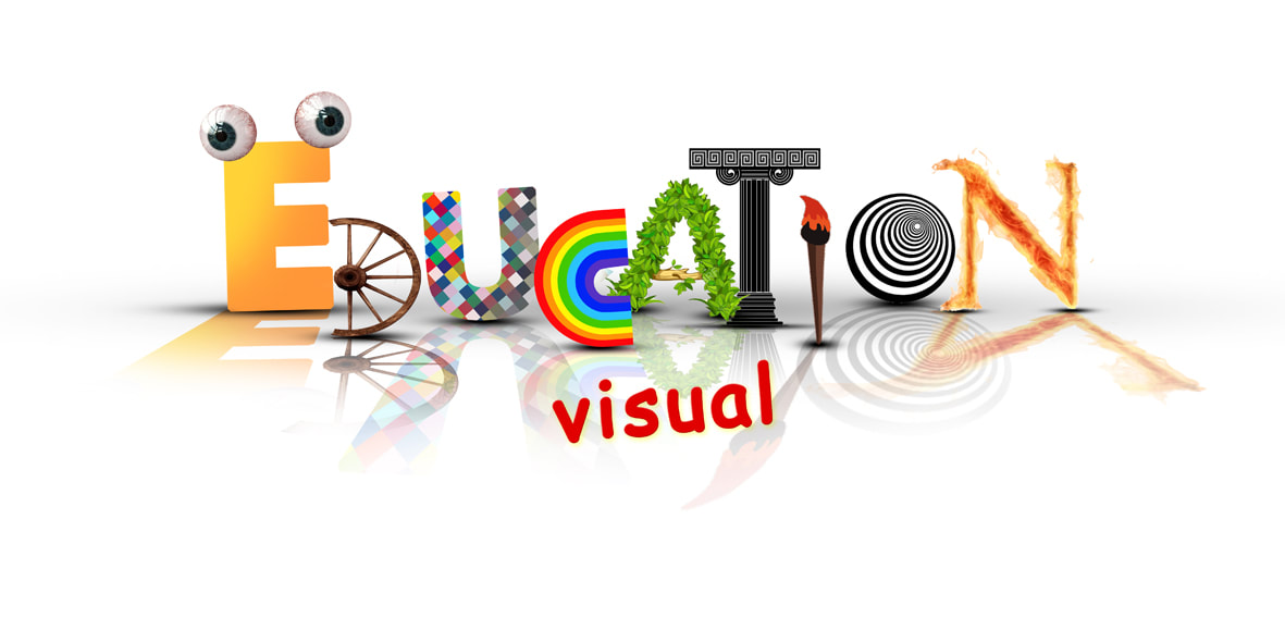
|
FUKUDA
|
EMOTION
|
Emotions are one very powerful tool and big brands are using it very good on the market in past and today. Emotional selling tool can be noticed everywhere in advertising world. The first video is from Kodak'1989, which says " What will be our memory without Kodak" and the second video from Kodak' 2010 which says "Real moments have to be shared with those who can't wait to see." In both videos we can see how the emotions are connectiong the users and the products.
|
|
BIGEST
|
495x700mm is the size of the bigest magazine.It was published fo first time in 1984. The Over-large format had been used on occasions in the past, poster-like proportions. Naturally, other extra-large format clones followed, but they didn’t hang around for too long. Its content reflected an obvious bias towards architecture, design, art and photography and ecological plight facing the world: De-forestation, rising sea-levels; suspect animal-husbandry; acid-rain:, made all the more compelling by the huge pictures that accompanied the articles. Just to compare the smallest magazine was only 74x105mm big, called Picozine.
|
|
PASSIVE
VS ACTIVE |
PASSIVE DESIGN is a system or structure that directly uses natural energy such as sunlight, wind, temperature differences or gravity to achieve a result without electricity or fuel.ACTIVE DESIGN is a system or structure that uses or produces electricity.The term passive design is most often used with respect to architecture and infrastructure. For example, a building may have wide windows that automatically let in more light when the building needs heat and automatically shade when the building is too hot.Another common area of passive design is wet infrastructure such as drainage systems that generally often don't consume power but use gravity to move water.Most devices and infrastructure have an active design as they use electricity. The term is typically only used in comparison to passive designs. For example, solar panels that produce electricity are often referred to as active solar as a comparison to using solar passively for heat or to grow plants. PASSIVE BENEFTS Passive designs are often valued for their simplicity and aesthetic appeal. They also tend to have zero operational costs. As they often contain no moving parts, passive designs potentially last for centuries.Electrical components are valued for their accuracy and functionality but may need to be regularly maintained and replaced. They may also have a higher operational cost and rnvironmental impact*.

|
