Some specific design situations, advices and solutions.
|
BRAND
|
What is real tiny meaning of different brands.

|

|
|
GROUP
|
Is always better when elements with some connection between, are close to each other. This helps to organaise the information and reduce the house by bringing out the structure. When the elemnets of the design are all over the page, looks disorganised , So the elements with logical connection between can be group together. The phisical nearest suppose connection.*

|
|
ALLINE
|
Is not good when something is on the page by accident. Eache element can have visual connection with other(s) elements. To alline the elements give the impresion of tidy and helps a lot in cases with large contents. When you organise the elements with invisble lines, you combine them visual.*

|
|
EMPTINES
|
What will happen if you have a book with 50 pages full whit text. And you have 60 pages book with same amounth of text and more white space.
Which book is more easy for you to read? Here we see how important is the white space for perception information. Leaving more white gaps between the elements give eye relax and chance to realis the information. 
|
|
CONTRAST
|
Using exactly same elements as fonts, colours, sizes, tickness, outlines or photos on the same work area can be a bit boring. If on the page you are using elements from the same type, is better they to be different. Contrast is one of the best ways to catch the attention over the page. Whit contrast you can have fresh look and same time visual steps between each element.*

|
|
BALANCE
|
The balance in design is very similar to the balance in physics. Having balance can insure stability, harmony and homogeneously of the design. This is expressed between colors, between shapes, between positions, between texts and many others.

|
|
UPERCASE
|
It is very inportat to know, that is not recommend to use a lot of capital letters.It is very hard to read text only with capital letters. We can do exceptios only when the word is up to 5-7 leetes, is big enought and we use it for purposes as titles. There is many other ways to make a text to stand out, such as thicnes, fonts, colors and so on.

|
|
GAZE
|
From hundred of years painters use the gaze sucssesiful in portrets and figurative paintings, in the same way we can use it for design. When the design include a gaze is recommend to turn it to the inside point direction of the work area. The viewer's gaze ususaly follow others gaze's directions. Also is good when the gaze is pointing into an importat element of the page, like title or price. This will finih and close the inside composition of your design.

|
|
COLOR
|
Colors are very importat in visula design, the way we use them can help us in many cases. The color use is very complecated, they can be affected by shapes , positons, size and so on. Their identity has many variaryty as tones , saturation, brightnes, lightness. These plenty color options can bring visual success into your design.

|
|
COORPORATE
|
What is Corporate design? Do you want the receiver of the letter to remind himself that this letter is coming form the same person who gave him his business card week ago. Or do you want the person who order food for home from flyer in his post box to recognize the company delivery car, which is parked 3 houses away on his street ? Corporate design means to keep one design style and be recognizable.

|
|
REPEAT
|
Repeating in design is very helpful. Is good idea to turn texts, shapes, colors, images, clips, spacing and effects into graphic elements To repeat helps for better construction, sequence, completeness and finish look. The aim of repeating is to unite different information in one big content.*

|
|
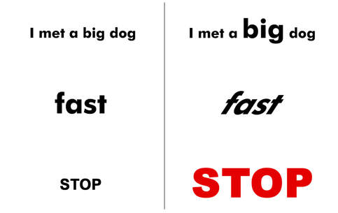
TYPOGRAPHY
|
Typography is the science for visual sign of the letters, in design the typography is very powerful tool and designer use it a lot. The letter signs can show us different things and tell us stories. Changing the size, shapes, colors, positions,structure and so on of the letters, can help feel the meaning of the words and make your design more understandable.*
|
|
LESS IS BETTER
|
Sometimes the essence of an information can be present differently. Presenting information with less elements helps the viewer for quick orientation and understanding. In this case the words as position, contacts, telephone or address are redundant. Now a days most of the people guess that 10 numbers one after one is probably telephone number, or www suggest web address especially when it is on a business card.

|
|
HARMONY
|
We can find harmony in everything for example between shapes, colors, and sizes. When there is harmony the designs is more unite and soft looking. In this case using same color gamma provide homogeneity and is also avoiding visual conflicts in the format.

|
* Resource materials, text and inspiration by Robbin Williams design book and other resources. All mataterials are use in puroposes of public education.For more resource information, please get in touch.
